The Dark Spectrum II : Bands of Color
This is a sequel to my previous post, “The Dark Spectrum I: Goethe and the Imaginative Interrogation of Color,” . In that post, I introduced Goethe’s dark spectrum and ended by proposing that such a spectrum might have something new to offer us. In this installment, I want to make good on that proposal and introduce an often, overlooked spectral phenomenon, and its connection to the dark spectrum.

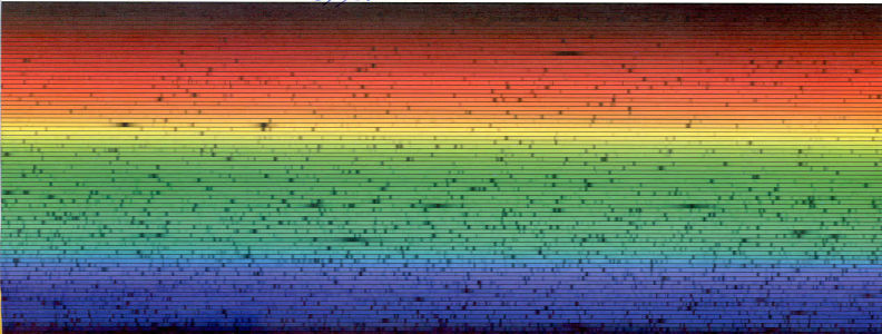
Figure 1. Solar spectrum produced with echelle spectrography, 10 m Keck telescope, Hawaii. (Source: Vik Dhillon, 2011, retrieved from: http://www.vikdhillon.staff.shef.ac.uk/teaching/phy217/instruments/phy217_inst_echelle.html)
To begin, we need to consider the concept of boundary colors—these are colors that appear when you look through a prism (or a transmission diffraction grating) at contrasting colors. If you hold a prism up to your eyes and view the world around you, boundary colors appear at the edges of objects and exhibit a very particular structure and color order. For purposes of simplicity, this phenomenon is most often observed by looking at the boundaries between black and white shapes.

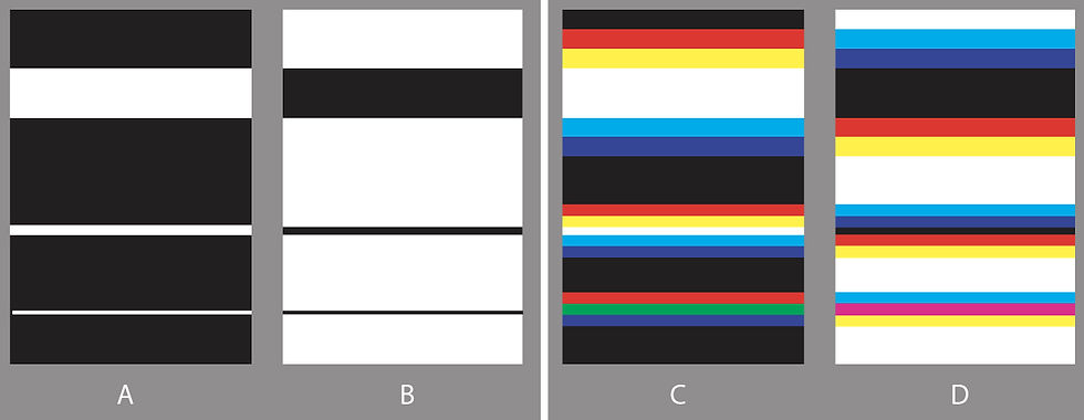
Figure 2. Image A is a series of white stripes of various widths, ranging from wide at the top to narrow at the bottom. Image B is the same array but with dark stripes on a white background. Images C and D are schematic diagrams of the preceding images when viewed through a prism, with the axis of the prism horizontal (parallel) to the stripes. (Source: author)
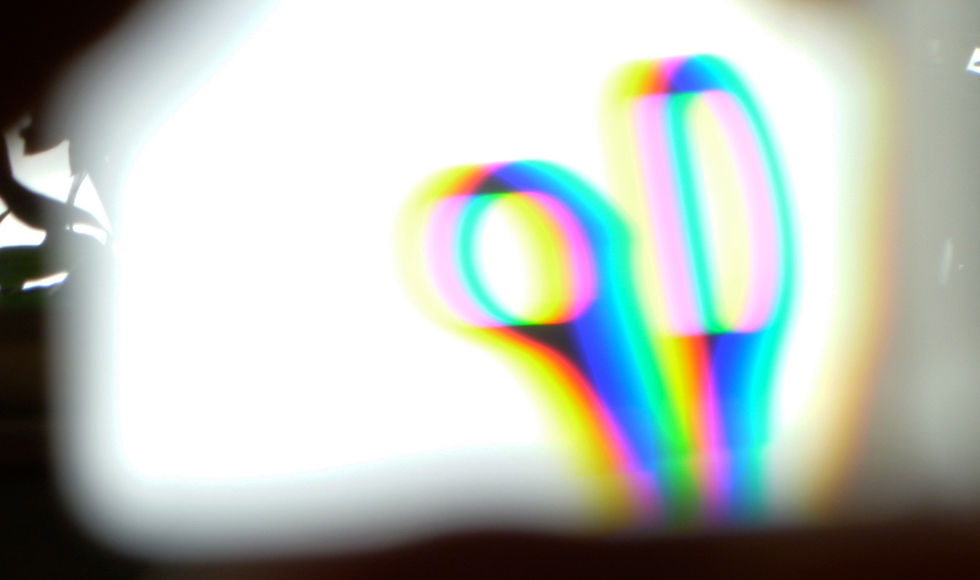
In Figure 2, Image A shows three horizontal white stripes on a black background; a large (thick) stripe at the top, a small (thin) stripe at the bottom, and a medium stripe in the middle. Image B shows the same arrangement but reversed, with black stripes on white. In C and D, the same set of images are repeated, however they appear as when seen through a prism. The colors at the edges are known as boundary colors. This phenomenon is well understood in color science[1], so I’ll just summarize how it works—it is the same as projecting these shapes of light and dark, through a prism, much like Newton’s iconic experiment. But instead of being refracted images of a slit of collimated sunlight on a dark background, the patterns are due to the edges of dark bands on a light background. There are three important things to note about the appearance of boundary colors in real life. First, like the graphic images in Figure 2, the colors appear “banded”—they have large areas of undifferentiated hue followed by relatively abrupt visible discontinuities where the hue changes. Upon close inspection, hue gradations are clearly visible, but from farther away, or when using a smaller target image (which amounts to the same thing) the banding becomes quite distinct. Second, this phenomenon is more distinct and defined when examining dark elements on a light background (dark spectrum) as can be seen in Figure 3, which is a photograph of a pair of scissors seen through two prisms against a bright white sky. Though there are some artifacts that result from the camera, the image resembles what the eye actually sees. The use of a second prism made the banding even more distinct, as the image shows.

Figure 3. A pair of scissors against a bright white winter sky in Munich, photographed through two prisms simultaneously. (Source: author)
And finally, the colors responsible for the banding effect in both the RGB and CMY images (Figure 2, C & D) appear to be formed by the presence and additive overlapping of three basic components; red, green and blue (for an explanation of the CMY effect, see my previous post) The banding appears much more distinct with the dark on light and can be easily observed by looking at a thin dark shape, like a light pole, against a bright sky. This is probably because the visible CMY bands contain twice as much light as the RGB bands (yellow = red + green, magenta = red + blue, and cyan = green + blue). This banding phenomenon, as simple and obvious as it is, has been insufficiently addressed in the literature. If we consider that boundary colors are basic spectral phenomena[2], and obey the same rules of generation, then it is all the more surprising. One explanation of this oversight could be due to the size and orientation of the original light source used to produce a spectrum. If the source is relatively wide with respect to the axis or direction of refraction (of the prism) and the degree of dispersion (like a wide slit or stripe), then the refracted components will overlap and superimpose each other a lot. This displays a more gradual and continuous gradient for the spectrum. However, reducing the width of the image in relation to the angle and direction of refraction, like with a thin vertical slit, reduces overlap and superimposition of the perceptual colors and the banding pattern becomes much more visible, like the bottom stripe in D (Figure 2). Alternatively, you can see the banding in the light spectrum, as in the high resolution spectral image of the sun in Figure 1, if you change the orientation of the image. To see this clearly, rotate the image 90 degrees so it looks like a vertical rectangle. Then the pattern of red, green and blue bands, with a thin yellow band will become more apparent. We are used to seeing the spectrum as a thin gradual band along the direction of refraction. This orientation foregrounds the gradual change between long and short wavelengths of the visible spectrum. However, it also hides its clearly banded macro-structure, which can be seen by altering the orientation or pattern of the incoming light source. A paper by Adams and Jennings[3] lays out the first real colorimetric analysis of the phenomenon, analyzing both the presence of constant hue bands and their relationship/interaction with each other. They hypothesize a simple model to explain the phenomenon, based on the perception and overlap of red, green and blue refracted components (bands). This, however, runs counter to our current understanding which views color perception as an essentially opponent process, based on four primary colors. And even at the receptor level, where we do have three overlapping components, the S, M and L response curves do not correspond to red, green and blue. Until now, no other explanation has been put forward to explain this simple, and easy to observe phenomenon. Though the visible portion of the spectrum is continuous, it only appears that way under specific viewing conditions. In other circumstances, like the dark spectrum, it appears discontinuous, banded and composed of three basic colors: red, green and blue.
Goethe may have been wrong about the answers, but he was right about the questions—questions we need to ask about the simple phenomenology of colors.
___________________________________________________________________________________________
[1] Bouma P. J. (1947). Physical Aspects of Colour. Eindhoven; N. V. Philips Gloeilampenfabrieken
[2] See Koenderink, J. J. (2010). Color for the Sciences. Cambridge, MA; MIT; Bouma P. J. (1947). Physical Aspects of Colour. Eindhoven; N. V. Philips Gloeilampenfabrieken; Newton, I. (1730). Opticks: Or, a treatise of the reflections, refractions, inflections and colours of light. The fourth edition, corrected. By Sir Isaac Newton, Knt. London: Printed for William Innys.
[3] Adams, L. W. and Jennings, C. (2015), Constant hue bands in boundary colors discovered using a new appearance model. Color Research and Application, 40: 135-146. doi:10.1002/col.21871
